User Guide for the Website
The successful finished Pipeline results in the permanently visible visualization part. Which differs from the rest of the pipeline since the pipeline is running hourly or daily. The visualization is always visible and reachable. But why is it represented within the pipeline? Since the data is pushed into elastic search daily it also can only be retrieved once a day by the frontend.
The basis of this front-end is adapted by a project of Emilio Rizzo and his project vue-d3-network. The core of force-directed graphs is used by his project and is customized to this project. The code basis is available on GitHub: https://github.com/emiliorizzo/vue-d3-network
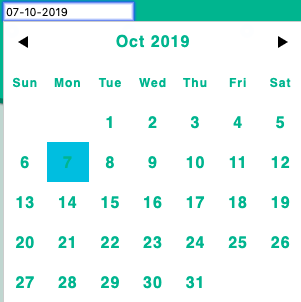
DatePicker
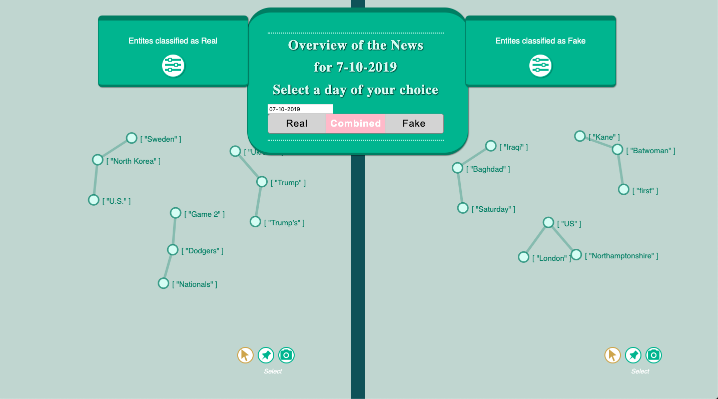
The Visualization represents all the entities which are crawled daily. In the middle of the page is shown which date is selected to represent graphs. This date is customizable and can be edit. Therefor a date picker is chosen which can be expanded by clicking on the input field of the date. After choosing a different date, different entities will be loaded. Warning: so far every date is possible to select but not every date has data. So if a selected date doesn’t represent entities the data is most probably missing.
Disable Graphs
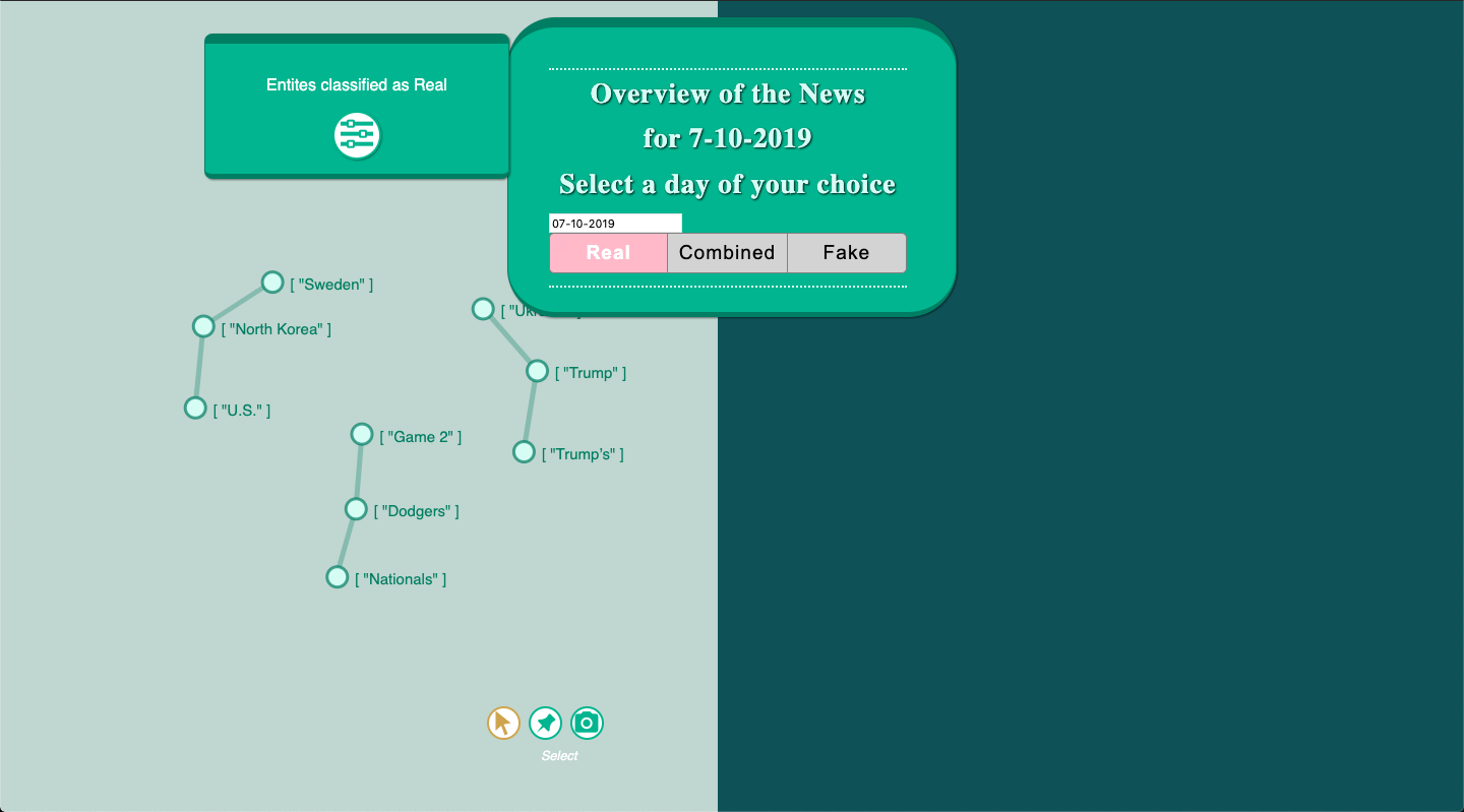
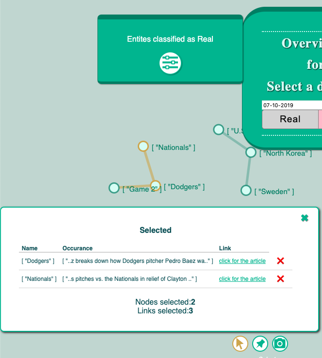
The default settings are that the graph for fake and real news are visible at the same time. In that way, a comparison might be possible between both graphs. Additional this tool offers to select one graph to focus on it. The tool gives three options Real, Combined and Fake. If the user wants to see only the graph with the real classified entities, the Real button needs to be clicked. To focus on the fake graph the Fake button needs to be selected. It automatically disables the other graph.
Graph
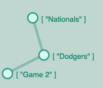
As mentioned in the pipeline information the visualization is supposed to show the entities which are created out of the articles. Each entity is represented as one node and has the entity name over it. When the entities are an occurrence in the same article they are connected with edges.
Hover feature
The user can hover over the edges and the color of the edge will change. This is supposed to improve the understanding of which entities belong to each other. The nodes changing the color as well when the user hovers over it.
Selection
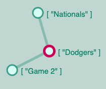
When the user selects one node by clicking on it, an additional pop up appears. The selected node name is visible and the context of the word. Currently, are n chars before and n chars after the entity occurrence within the article visible. It is supposed to give the user a first idea in which context the entity is used. In case the reader is interested in reading the original article the click for the article button can be selected. This button will open an additional tab within the browser with the website of the article.
Furthermore, are more than one node selectable. The list can be extended to several entities. The same pop-up window has the option to deselect the entity again. This function is represented by the red cross. The number of selected nodes and links are represented below the information. In case more entities are selected as there is space a list will be created so that the user can scroll down to see the other selections. At the same time as the entity is selected the color of the node is supposed to change to be represented as selected node.
The main idea is here to get an intuition of the context and how these entities might be related to each other. It directly gives a quick overview of what happened with the entity and also provides the location of the original article.
Force Directed Graphs
All the nodes, edges and graphs are represented in a force-directed graph. That means the user can select a node and by dragging it around the node moves. Not only the single node is moving also the depending graph moves with it. Since there is force involved each node is moving when the nodes get closer to each other. This is an eye-catching feature that increases the user-experience.
Further tools
Since the nodes are freely movable, a feature is added that the nodes can be fixed to a certain point. This feature can be activated by selecting the pin symbol on the right lower corner of the graph. After activating it the user can pin nodes to a fix position. This function disables the selection of the nodes which can be activated again by selecting the arrow symbol next to the pin symbol. The third symbol which is represented as a camera enables the user to take a screenshot of the current graph which can be exported to the disk of the computer.

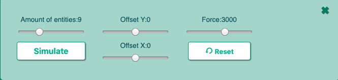
Settings
The settings of the graph can be configured. To open the settings section the user need to click on the sign of toolbox. Within the setting, it is possible to increase or decrease the number of entities. The slider can be moved in either to the left side which decreases the amount and increases by moving it to the right side. After selecting the simulate button the new entities will be rendered within the graph. The graph has a center around which the nodes are created. The center can be moved on the Y and X-direction. Additional is the amount of force be configurable. The reset button does what the name says it resets the Offset value to 0 again.